Email:

tianyinglyu@gmail.com

Email:

tianyinglyu@gmail.com

tianyinglyu@gmail.com

Call of Duty: Mobile —
State Feedback in a Chaotic Multiplayer Mode

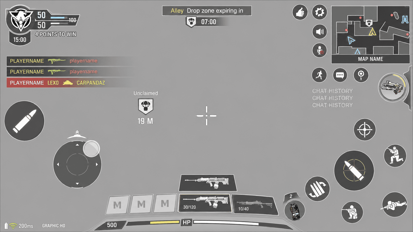
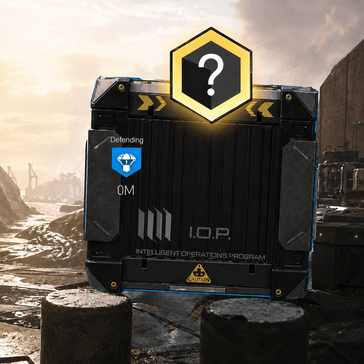
Reducing cognitive load in Drop Zone by prioritizing objective, reward, and status information across HUD, diegetic UI, and existing interaction patterns.

Responsibilities

As the sole UX designer for the feature, I owned wireframes and UX documentation, collaborated with game designers to align on design pillars and gameplay requirements, worked with engineers to understand technical constraints, and iterated based on feedback from the UX director.

Drop Zone shipped as part of Call of Duty: Mobile’s multiplayer content

Company

Tencent Games

Timeframe

2021

Category

System state, UX

Drop Zone

Drop Zone is a limited-time multiplayer mode where two teams compete to control a rotating zone on the map. The controlling team periodically earns Care Packages, which can provide powerful rewards and help secure victory.

UX Design Challenge

Drop Zone added a new layer of objective and reward information to an already dense FPS interface.

The core UX challenge was information overload. If every gameplay state competed for attention at once, players could miss the objective, lose track of care packages, or feel overwhelmed by the screen. My goal was to decide what information should be persistent, what should appear contextually, and what could wait until after the player took action.

Information Audit

I started by auditing the information introduced by Drop Zone and grouped it into three categories: Drop Zone information, Care Package information, and existing combat information.

Players needed to track:

  • rotating zone location

  • zone timer

  • zone status

  • care package drop location

  • care package availability

  • acquisition progress

  • gained items

  • player positions

  • killstreaks and scores

  • alerts and threats

  • player status

  • team scoreboard

All of this happened while players were aiming, moving, and fighting

Priority Model

To reduce information overload in a chaotic mobile FPS environment, I ranked gameplay information by two criteria:

Urgency: Does the player need this information immediately?
Actionability: Can the player act on this information right now?

This helped determine whether information should be always visible, contextual, supporting, or delayed until after action.

Tier 1 — Critical / Always Visible

Purpose: Help players stay oriented and make immediate movement decisions.

Information

Why Matters

UI Treatment

Drop Zone location

Players need to know where to move next

Floating world-space icon

Drop Zone status

Players need to know whether the zone is locked, active, claimed, defended, or contested

Icon state / color / status treatment

Drop Zone timer

Players need to understand time pressure

Persistent HUD timer

Critical combat alerts / threats

Players need to survive while pursuing the objective

Existing combat HUD / alert system

Design logic: This information directly affects survival, movement, and objective play, so it needs persistent visibility.

Tier 2 — High Priority / Contextual Action

Purpose: Surface actions only when they become relevant.

Information

Why Matters

UI Treatment

Care package drop location

Players need to know where rewards may appear

World-space marker / minimap indicator

Acquire action

Only relevant when the player is close enough to interact

Contextual acquire button

Acquisition progress

Players need confirmation that the claim action is working

Progress indicator / loading bar

Newly acquired reward

Once acquired, players need to know the reward can be used in combat

Highlight in Scorestreak panel

Design logic: This information is important, but not always relevant. Showing it contextually reduces clutter and keeps attention on combat until the package becomes actionable.

Tier 3 — Supporting Awareness

Purpose: Help players understand the broader match context without competing with immediate objective information.

Information

Why Matters

UI Treatment

Minimap context

Helps players plan route and understand battlefield position

Minimap marker

Team score

Helps players understand match progress

Existing scoreboard / HUD

Player status

Helps players manage survival and combat readiness

Existing player HUD

Killstreak / Scorestreak status

Helps players understand available combat tools

Existing Scorestreak panel

Design logic: This information helps players make better decisions, but it does not need to interrupt the player’s immediate combat/objective focus.

Design Application:

Mapping Priority to UI Placement

The priority model guided where each type of information should live.

Persistent information used high-visibility UI, such as world-space objective markers and the HUD timer.

State System

I designed state feedback for key Drop Zone moments so players could quickly understand whether an objective was available, controlled, or in conflict.

These states translated gameplay rules into quick visual cues, reducing the need for players to stop and interpret text during combat.

Each state needed to be recognizable at a glance in a visually noisy combat environment.

Care Package Interaction Flow

Care Packages only appeared inside the Drop Zone, a tight objective space. Because players could usually notice packages as they dropped from the sky or landed nearby, I chose not to over-signal their existence across the full HUD.

Instead, I focused the UI on helping players understand the package’s exact position, interaction availability, and acquisition progress.

1. Package drops into the Drop Zone

The package appears through the in-world drop animation and lands inside the active objective area. I marked the package’s exact position on the minimap.

Design reasoning:
Since the Drop Zone is spatially contained, players can visually notice the package without needing a global alert. The minimap supported additional precise spatial orientation.

2. Player approaches the package within the zone

Once the package has landed, the player needs to quickly identify its exact location while still navigating combat and objective pressure. I added a large diegetic icon above the package’s in-world presence as the primary discovery cue.

Design reasoning:
The in-world icon helped the package stand out in the immediate combat space without requiring players to scan the entire HUD.

3. Player acquires the package

The package becomes actionable only when the player is close enough to acquire it. After the player starts acquisition, the system needs to confirm that the action is in progress.

Design reasoning:
I kept the acquire button contextual so it would only appear when the player could act. This reduced unnecessary prompts and made the interaction feel tied to player proximity. The progress indicator was important because acquisition takes time; it reassured players that the input had registered and helped them judge whether to continue claiming or react to nearby threats.

  1. Reward moves into the Scorestreak panel

Once acquired, the package disappears from the world and the reward moves into the existing Scorestreak panel, where players already know how to activate rewards.

Design reasoning:
I reused the Scorestreak panel because it was already a familiar reward-use area in CoDM. This reduced learning cost and avoided introducing a new control during a high-pressure mode. A highlight state connected the acquisition moment to the next action: the player now has a reward available to use in combat.

Outcome

Drop Zone shipped as part of Call of Duty: Mobile’s multiplayer content.

Through this feature, I learned how to design for high-pressure, information-dense gameplay on mobile. The project strengthened my ability to prioritize information, define interaction states, document system behavior, and collaborate across game design, engineering, and UX leadership.

Reflection: What I Would Improve Today

Looking back, one key improvement I would make is reducing reliance on color to communicate critical states.

The original system used color to help distinguish states such as locked, unclaimed, claimed, defending, claiming, and conflicting. Today, I would create stronger differentiation through icon shape, outline, fill treatment, motion, and symbol variation.

This would make the states more legible during high-action combat and more accessible for players with color vision differences.

Some of my other work

Back to top

Back to top

Let's create
something
together.

Hit me up if you have a project in mind or would like to chat

Back to top

Back to top

Let's create
something
together.

Hit me up if you have a project in mind or would like to chat

Back to top

Back to top

Let's create
something
together.

Hit me up if you have a project in mind or would like to chat