Email:

tianyinglyu@gmail.com

Email:

tianyinglyu@gmail.com

tianyinglyu@gmail.com

Team Planner Redesign

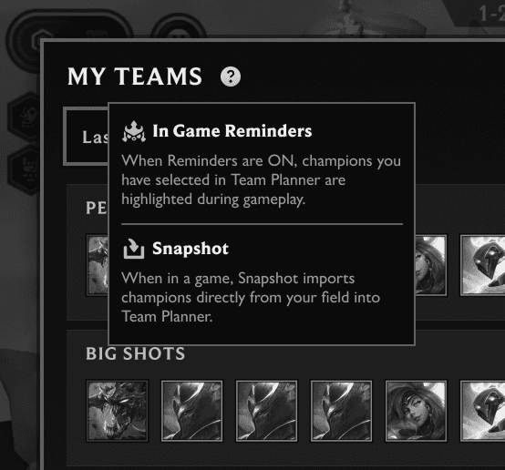
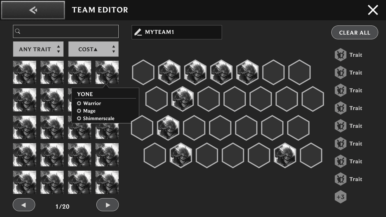
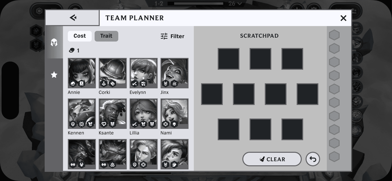
Teamfight Tactics (TFT) is a strategy game with over 30M monthly active players, where players must make fast, high-stakes decisions under uncertainty. As part of the Team Planner redesign, I helped evolve the feature from a lightweight tool into a decision-support system used by players across all skill levels.

Responsibilities

I craft UX/UI experiences end-to-end, from research and wireframes to high-fidelity user flows, prototypes, and in-engine implementation. Collaborating with game design, production, engineering, QA, and fellow UX/UI teammates, I drive concepts into deliverables.

Company

Demiurge Studios, Riot Games

Timeframe

2022-2025

Category

Strategy planning, game tool

Problem

TFT players were facing:

  • High complexity (units, items, traits)

  • Randomness (shop and item drops)

  • Time pressure (30 seconds per round)

The original Team Planner had a one-page layout. While advanced players already used it as a flexible scratchpad, newer players weren't engaging as much.

Insights

I wanted to preserve the flexibility for advanced players, but make this experience more useful for players of all skill levels.

Players need to make fast, adaptive decisions under uncertainty.

The tool must therefore:

  • surface relevant context instantly

  • support multiple strategies

  • integrate directly into gameplay

To address this, I focused on three design principles:

Support multiple strategies

Enable players to plan and pivot between multiple compositions

Reduce decision friction

Make key information accessible at a glance during gameplay

Bridge planning and gameplay

Integrate the tool directly with in-game interactions

Solutions

Multi-teams Planning

In TFT, decisions are shaped by random shop outcomes and opponent strategies, requiring players to constantly evaluate and pivot.

This introduced the need to support flexible planning.

In-game shop

I expanded the planner from a single composition into a multi-team system

  • Introduced a list view that allows users to see multiple compositions at a glance

  • Designed interactions between list and editor views to support both comparison and focused editing

To define this structure, I created flow charts and grey-scale wireframes to map the hierarchy and interaction flow between views.

By prioritizing units at the top level, it enables quick comparison and/or matching with current board or shop content.

Reduce Friction

Introduced tooltips systems

  • Reduced reliance on memory and external tools

  • Focused on surfacing only essential information mid-match

Reduce Entry Friction: First-time User Experience (FTUE)

I designed the FTUE prompting users to create their first composition.

This reduces initial friction and helps users quickly understand how to engage with the tool.

Reduce Mid-Match Friction: Preserving User Context

In TFT, players frequently switch between gameplay and the planner within a limited time window. Adapting to this use case, I designed the planner to persist the user’s last state when reopening.

Built-in Gameplay Integration

Reminder Toggle

A key challenge was that planning often felt disconnected from gameplay. Players could plan strategies, but struggled to apply them in real time under time pressure.

To address this, I designed the reminder toggle across mobile and desktop platform. Once turned on:

  • Displays visual indicators on units when they are part of a planned composition

  • Brings planning context into the moment of decision-making

Snapshot

Designing for Safe, High-Speed Actions

The Snapshot feature allows users to import their current board into the planner, supporting convenient iteration.

The time pressure introduces a key risk:

Players may accidentally overwrite existing compositions.

To address this, I focused on making the interaction safe without slowing users down.

  • Designed a non-destructive confirmation step

  • Allowed users to review and cancel

  • Ensured the interaction remains lightweight

Accessibility & Visual Clarity

To reinforce this critical moment, I designed a confirmation state with a strong visual cue.

  • Conducted color accessibility testing across multiple vision types

  • Selected a glow effect with high contrast and visibility

  • Ensured the action stands out clearly in fast-paced gameplay conditions

Iteration & Tradeoffs

Compendium vs. In-game Utility

Early exploration included a full compendium.
However, given strong third-party ecosystems, we shifted focus to in-game decision support, where we could add the most value.

Compendium Wireframe

Competitor research on external sites

Manage Controls

Managing multiple team compositions made edit and delete actions frequent and time-sensitive, especially under gameplay pressure.

To ensure these interactions felt intuitive and frictionless across both mobile and PC, I explored multiple approaches and evaluated each based on discoverability, speed, and error prevention through click tests and design reviews:

  • Direct edit/delete buttons: provided immediate access and high visibility, minimizing interaction cost

  • Mode switching (edit vs delete): reduced visual clutter, but required users to manage states, increasing cognitive load and risk of errors

  • Tap-to-edit with kebab menu for secondary actions: improved scalability, but introduced additional steps and reduced action visibility

Decision & Result

We launched with direct edit/delete controls to prioritize discoverability and speed for the initial release, and used a red visual treatment for delete actions to reduce errors in high-frequency interactions.

As the feature evolved and required additional actions (e.g., sharing, extended management), we transitioned to a kebab menu pattern to support scalability without cluttering the interface.

Post-launch data also showed that the Reminder toggle was the most frequently used action, leading us to elevate its prominence while moving secondary actions into the kebab menu to improve visual hierarchy.

Impact

The Team Planner redesign—featuring my contributions on the Reminder toggle, Snapshot, and multi-team support led to

25%

increase in adoption

By Set 13, the set released right after the redesign, nearly

Every Player

was engaging with the Team Planner

Some of my other work

Back to top

Back to top

Let's create
something
together.

Hit me up if you have a project in mind or would like to chat

Back to top

Back to top

Let's create
something
together.

Hit me up if you have a project in mind or would like to chat

Back to top

Back to top

Let's create
something
together.

Hit me up if you have a project in mind or would like to chat